
For my design, I used a combination of circles, colors and lines. I used tools like spirograph and transformation. I think this demonstrate my skill and creativity because I drew an eye with a lot of detail. I would like for people to notice that I use specific steps to create this eye...it wasn't easy!!!

This is my Glitch Mob Wallpaper design...
Here we have a background image of the Milky Way Galaxy that was taken by the Hubble Space telescope. The logo is of a band called Glitch Mob.

So for this assignment, I had to choose a country and three images from this country. Then I had to blend these three images using Adobe Photoshop. I would finally add the name of the country and add the finishing touches to my art piece like the gradient outline around the photos. I have learned a lot of different things from this assignment like how to blend different images and adding layers to place the images within the mane of the country.
So I chose the country France because it is a magnificent place to travel to. There are a lot of extraordinary place that you can go to see.

|

|
These are images of hands. I made the after image black and white because when comparing these images, you have many more details in the black and white image than in the original. I did not really do much when I edited this image: I just made the picture black and white and raised the clarity. Look at how there is more details in the second image based on the lines on the fingers, their position and the shadows.

This picture was taken outside on a sunny day. As you can see this picture does not have a lot of color in it. Now look at the image beside it. ---->
|

This image is the just a copy of the image beside it. The only difference is that, as you can see, it has been enhanced to have better qualities. It has more vibrant colors, it is more clear and detailed than the original. Even the background, being out of focus is more beautiful than the background of the previous image. Focus on the color and the details of the image and compare it to its original.
|

|

|
As you can see, the picture on the left is the original and the image on the right is the after image. These images were taken in a light box using the macro-mode setting on the camera. A macro-mode image is a close up picture of an object that is smaller that your hand. When I edited the image on the right, I played around with the setting for the image: I raise the saturation, clarity, etc. What you should look at in this image is that the colors are much more vibrant than in the original picture.

This is an image that was created using Photoshop. To be honest, there were quite a few things that improved in this image when comparing this image to the previous image about the country that I would travel to. So some things that improved in this image would be the images, they have higher resolutions so they have more details. The background in this image has more colors in it and the glow around the letters is better than the other image...

This is a Parrot! I drew this picture and also colored it in using various tools in Illustrator.

This is a replica of the drawing above but the coloring in was using Photoshop.

This image compared to the previous image that I created has improved a lot. For example I used a new tool in this image called Bevel and Emboss. It has more images and they are also better blended.
Three Hawaiian Islands that I used in my image are:Hawaii, Maui, and Kauai.

So my friend Andrea and I are walking into the classroom like its an ordinary day, and we see this cool camera on the table. Andrea was all like "Let me take a pic of you" and I replied "Sure". So after we took the picture I decided to take a pic of Andrea, but then after I took the pic the walls got taller and I got SHORTER! Andrea and me had SHRUNK!!! We were in no panic really, we enjoyed it actually. After we played Hide and Seek, me and jose decided to document this one in a lifetime event, I went on Facebook and Andrea went on Instagram. #FEELINGSMALL!


There was a Karate tournament last week, so we told our giant friends to give us feedback about our fighting skills to see if we needed to improve on something or not.

So I tried to make this my best work yet. I added shadows to some of the objects, but then I realized that some of the other objects did not have any shadows. I think that the posing has improved a lot which I think makes the picture look more real.
In the story, the person on the snail (Alondra) and me are the evil guys and the other two people (Wiexaun and Rubi) are trying there best to escape us, the villains.
The purpose of this project was to choose one of the following:
Music/Audio Production
Animation
Video -
Photography -
Graphic Design -
Digital Illustration -
Digital Collage,
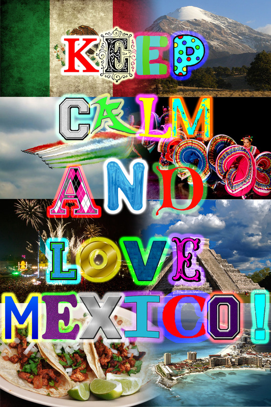
I chose the Digital Collage. My project is based the culture and history of Mexico. I would like for you to notice that the project was professionally created by a professional student her at New Tech.The poster itself shows a little bit of about everything I know about using photoshop... from resizing to blending and fading, to editing contrast and brightness, and outer glow on the letters. I chose this specific project to do on Mexico because I originate from Mexico. This project took quite some time to complete. I first had to find the pictures that I was going to use. Then I had to blend and fade the images together. The letters were also found on the internet but because the images had parts that i did not need, I had to go through every letter and cut out only what I wanted. After that, the letters were placed the the poster and arranged with a last finishing touch of the outer glow. Like I said earlier, the thing that connects that the creation has with the creator (me), is the culture that it represents.
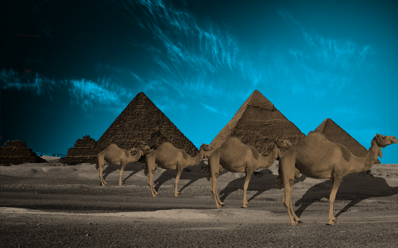
This is my project for Finals. This is also last project for this class. I started with the image being all black and white and as I progressed though the image, it got its color and the camels were in a different picture. I had to color them as well and then paste them on the scenario.
